One of the biggest task at the hands of a business is to convert visitor into lead. This can be done by offering content, landing pages and design that is relevant to the visitor and more likely he will like the information and exchange details. After, exchanging details visitors become leads and by targeting them you can convert them into customers. Clearly, in present times every business is after leads and this post will help them, in doing that.
What is Conversion Path?
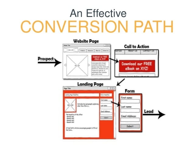
Conversion path can be of 2 ways. If you go to HubSpot they will only describe it as one. But, common logic suggests there needs to be 2. One, user will directly come to a landing page which has great content and call to action button, then you are taken to another landing page with form, email filing etc. and then, you have a thank you page for visitor as he provided you with the information.
The second case is, the first page that user visits i.e. the landing page, has form, asking for email etc along with the information on the same page itself and then, a thank you page. Instead of multiple landing pages, there will be one landing page. This also will qualify as a conversion path. In fact, the example of SalesForce, which I discussed in previous post will clearly define this path of second case.
After, converting them into leads we can move them to become customers and maybe even into people who promote your brand.
Designing a Good Conversion Path
As discussed above a conversion path comprises of four elements content, landing page, call to action button and a thank you page.
1) Content
Content should be relevant and engaging. You don’t want the visitor to lose interest. Compare this with a date. You would want your partner, to be charming, engaging someone who is interested in you. It works the same way for inbound marketing as well. You will want your audience, to be engaged in your content and you want to know them better and want their details.
Content should neither be too long or too short. It should clearly define, what person actually requires. Content is there for a reason to solve visitors need and not just for search engines. Make it a point that you will consider quality content first and keyword density later.
Also, make sure space around content is clear, theme used is crystal clear and content visibility is good.This is another way of making content more readable for user. Content should not have a lot of advertising.
Content should try to address, the stage of buyer journey the visitor is in. Try to write content for each and every stage to get maximum number of conversions.
Try to analyse who your buyer persona will be and write content accordingly.
Also, remember the points about writing content which we discussed in previous posts.
2) Landing Pages
Landing page should be such that user has a good experience with it. Make sure theme is clear. Try to use only 2 colours on theme. Don’t try to put too much on the landing page.
Make sure, right visitors come to the landing page. If you are selling shoes you don’t want people looking for bakery. This will depend on your landing page. Make sure whichever be the medium, landing page for the user should be related to what the person requires.
Align your buyers persona with landing page. Think, who your ideal customer will be and try to think what will he might be looking in your website. Design landing page accordingly.
Also, try to capture the correct stage of buyer journey visitors you want. If visitor is looking for information, then landing information do that exactly and if he is looking for a solution, provide him with that landing page.
Make sure landing pages are fast and comply with Google standards. Your search rankings will depend upon that, also users like websites that load faster.
3) Calls to Action
Make sure your call to action attract the attention of the visitor. The colour and location of call to action button should be such that, you are able to convert maximum amount of customers. Call to action should not be surrounded by lot of text, images or other information.
Placement of Call to Action works differently for different websites. For some placement on top leads to more conversions. For others, at the bottom might work. You will need to test it for your website.
Also, try to make sure call to action buttons are not just “click me” or “submit” text written on them. Make it more enticing so that user clicks on it. Have something like “show me how” or “help me”. Me works better than you. This has been proved by research. So you might try using it.
4) Thank You Pages
You would like to thank visitor, for taking action and moving to next stage. You might also try to guide next steps to him through this thank you page. For example writing that a “confirmation email has been sent please verify” or “we will shortly get in touch”. Also, you can try to personalise things as much as possible. Like addressing visitor by name and place, to where he belongs or maybe something about product or service he is interested in or assuring him that he has made the right choice. All this and more, can be done with the help of thank you page.
These 4 elements when done right, will surely boost conversions into leads. We will discussing more about conversion process in our inbound marketing certification course. In case, you need any help or information about inbound marketing strategy, you can contact The Buzz Stand Team.