
Landing pages have always been an important point while designing your inbound marketing strategy. After knowing, what are the best practices for landing pages and what successful landing pages are, it is important to look at some real examples as to how websites use it to increase their revenue. Let’s have a look at it as to how they have been able to utilise this.
-
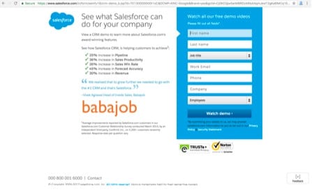
SalesForce
It is one of the best examples which uses landing did you effectively for generating more leads. As you can see in the image below, it has a form on the right side which is pretty clear and distinct. It attracts the attention of the user, by its distinct blue blue colour form on a white background page. On the left side, you can see testimonial as well as certain point. We have discussed this earlier as well that testimonials prove to be a great source to generate revenue. All in all, this landing page is one of the best examples you would like to implement for your inbound marketing strategy.
-
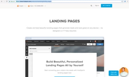
HubSpot
HubSpot is one of the leading websites, which helps users in designing landing pages for their website. No wonder it’s landing page is one of the best. It has used subtle colours across and clear theme which helps users understand what it is about clearly. It has a click to action button which is trying to get attention of the visitor. It’s placement is in the centre certain information below the call to action. Do have a look at it as it is something you might consider it for your business as well.
-
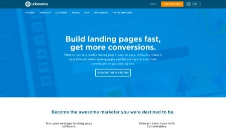
Unbounce
Unbounce also provides landing pages like HubSpot. It’s landing page is similar to Hubspot except colours. It has blue background, conveys message clearly and has call to actions on the top and bottom of the page which are clearly visible and enticing users to click on it. The content also is written in such a manner that after users feel like moving to the next stage.
-
Khan Academy
It is the website offering free courses for everyone. It has students, teachers and parents as well on this platform. All the courses are available in video format pretty easy to use. If you have a look at it is landing page you will see the clear thinking that has been used along with call to action buttons which are enticing users to click on it. The page has been designed kept in mind a specific audience and clearly explains what it is for?
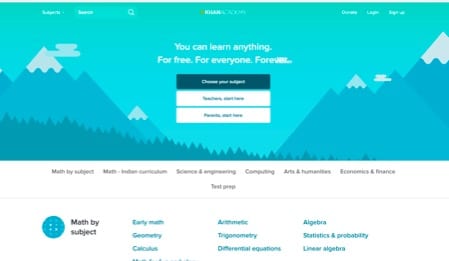
khan academy landing page design
-
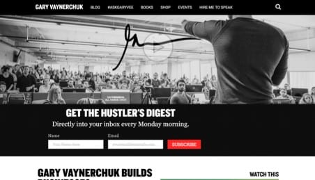
Gary Vayenerchuk personal website
Gary is one of the biggest public speakers at the present moment. If you go to his website, you will see that it is pretty clear with a black and white theme and has call to action button in the form of subscribing for email. It has been kept at such a place that it is enticing users to click on it.
Key Takeaways from these Examples
There are certain common things in all the landing pages you might have noticed. I will list it down so that you can use them
- Every landing page above had a clear, simple and a crystal colour theme.
- Pages don’t have lots of text
- Message about what the page is conveyed clearly in all pages
- There has been use of 2 colours only.
- Call to Action button design is placed at appropriate place and is enticing users
- Use of infographics, images and videos to explain the features or benefits or take the user to the next stage of buyer journey
Also do A/B testing for your landing page. As, some colours and themes might work for some but not for others. But, the basic idea remains the same. If you do use them, in your landing page I can guarantee you will have a boost in your conversion rate. For learning and reading more you can visit our inbound marketing certification course. If any help or information about digital marketing strategy is needed, you can contact The Buzz Stand Team.